24 December 2020 —
Two days ago I released the first major version in almost 2 years for shlink-web-client, a web UI for shlink, my self-hosted URL shortener.
This new version introduces several improvements to the project, and I thought it was worth writing a post to explain all of them in depth.
New design
The project has been using the same design almost since the beginning. It was clean, but it laked a bit of contrast and consistency in many sections.
Now the main background is light-gray, with components composed in white cards with a slight box shadow, that makes them easier to spot inside the app.
Also, the main area has now a max-width that prevents components from stretching too much on wide screens.
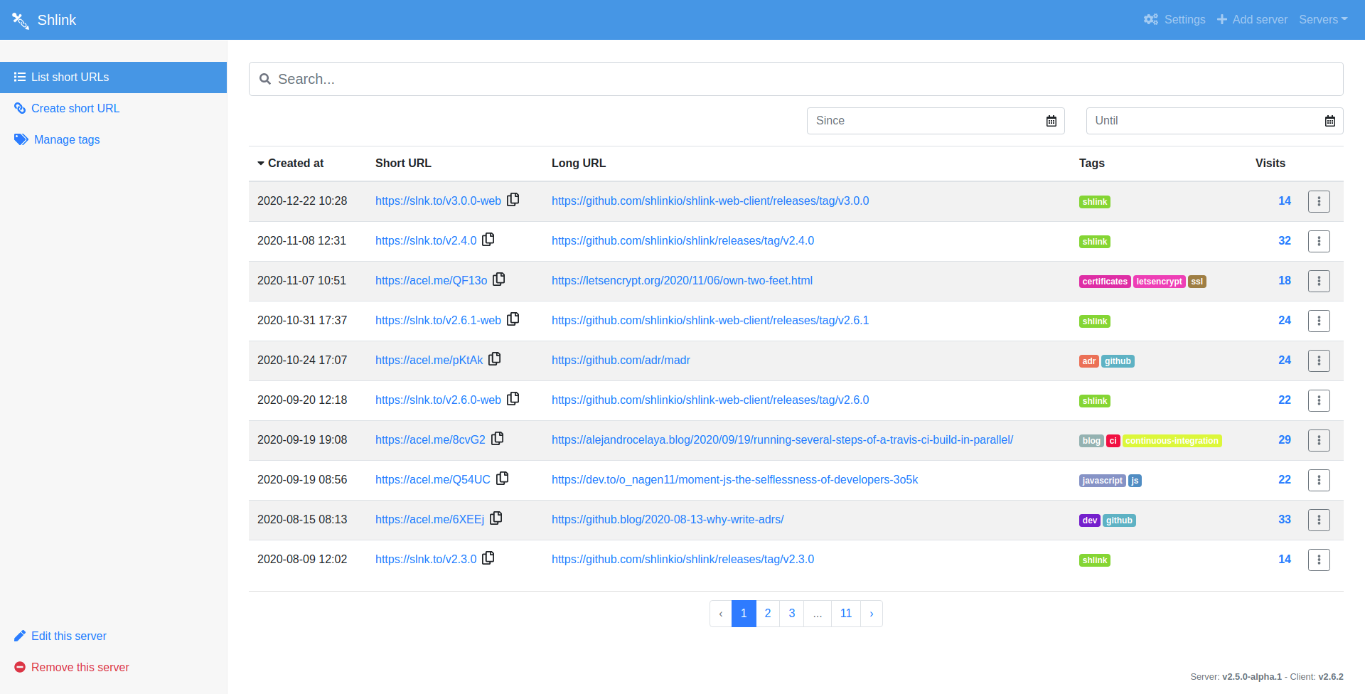
Before
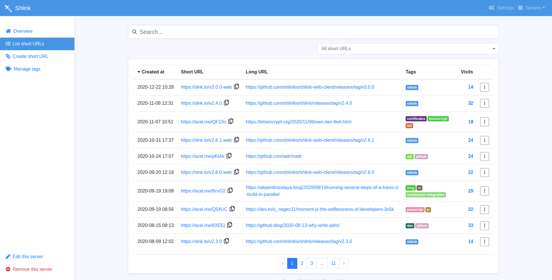
After
Overview page
Up until now, after connecting to a Shlink server, you went directly to the list of short URLs.
With this new version, you now see an overview page first, which displays some general stats, a quick short URL creation form, and the latest 5 short URLs.
From there, you can navigate to the full list of short URLs, with filtering capabilities, or go to the advanced short URL creation form.
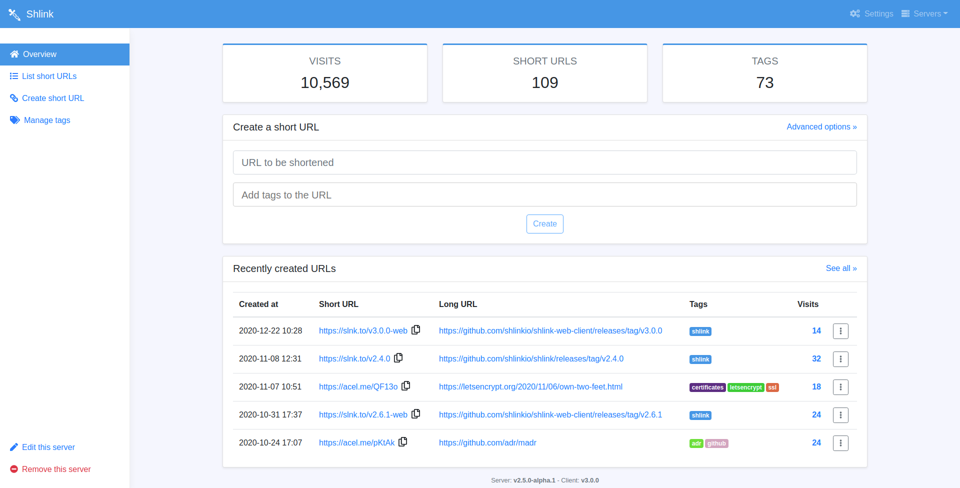
Overview
Improved short URL creation form
One of the sections with more room for improvement was the short URL creation form. It had all the inputs mixed, displaying just the “long url” one, with the option to un-collapsing the rest at will.
The new design groups the inputs by context, which makes it more clear. It also displays the inputs all the time, since the “quick form” is now located in the overview page.
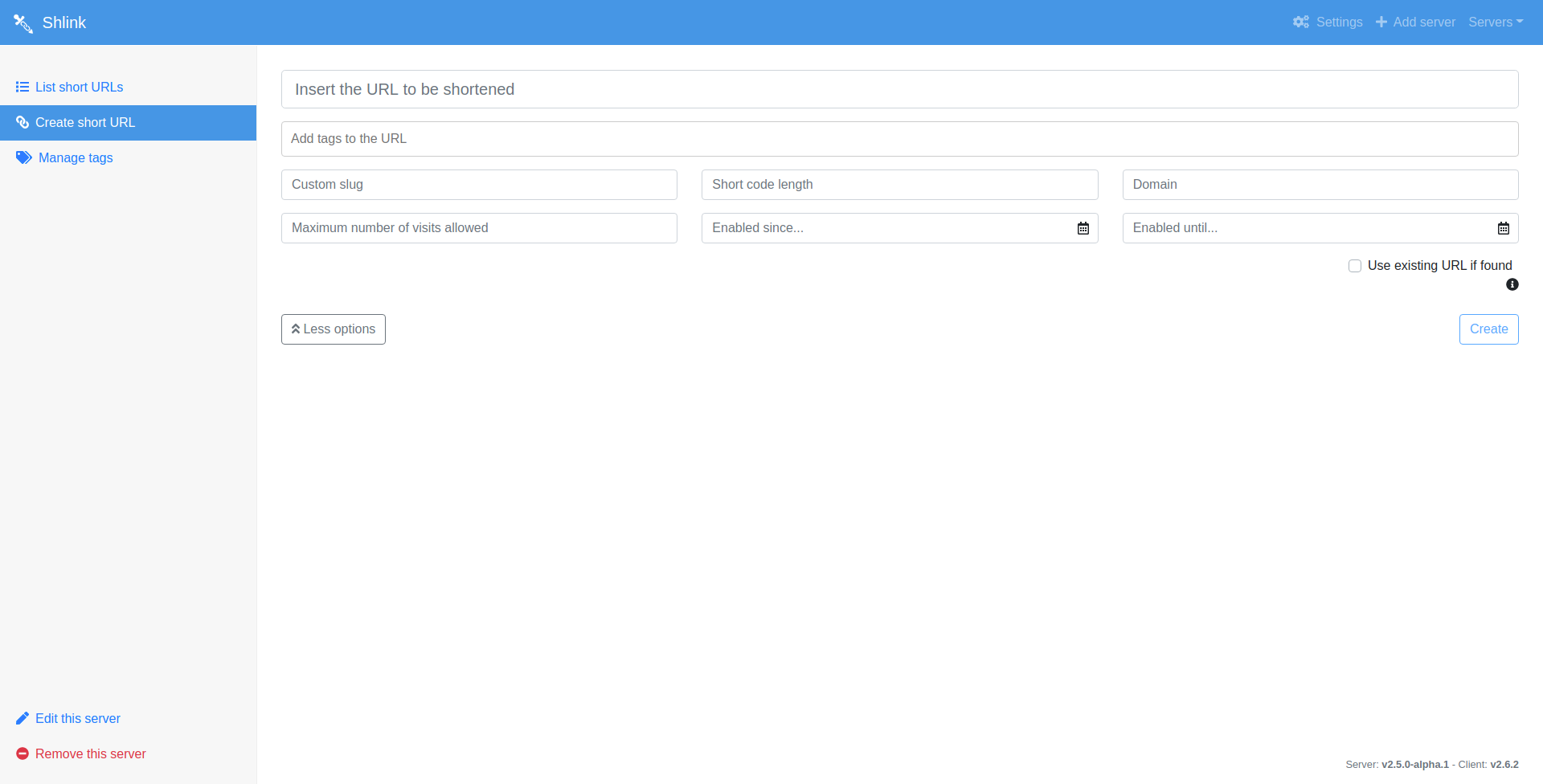
Before
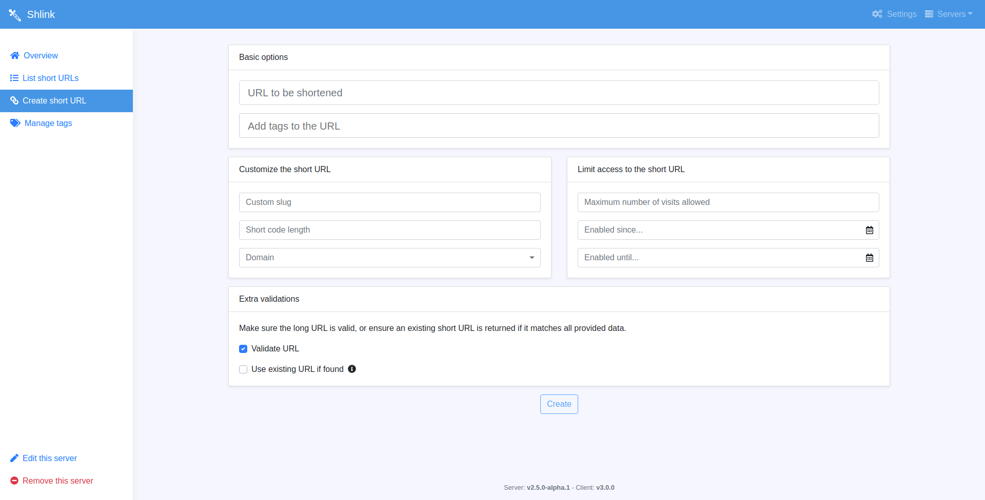
After
Enhanced visits page
The visits page had a problem, it was trying to display too much information in a single place.
- Visits over time
- Visits from every platform
- Visits from every location
- A list of visits as a table
The new approach splits those in subsections with their own sub-route each (/by-location, /by-context, etc). This helps to render a smaller amount of charts at once, since they are a bit CPU greedy.
Also, only the visits from the last 30 days are loaded by default, making it load way faster for URLs with a lot of visits.
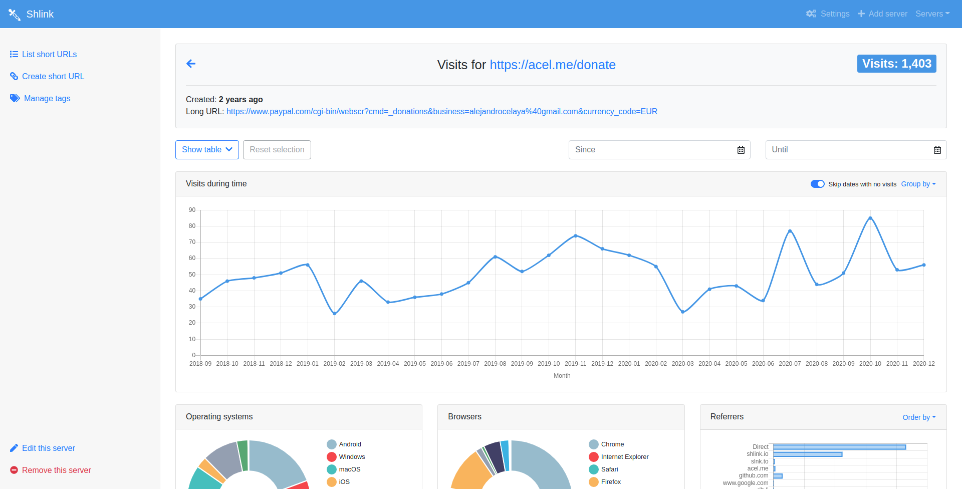
Before
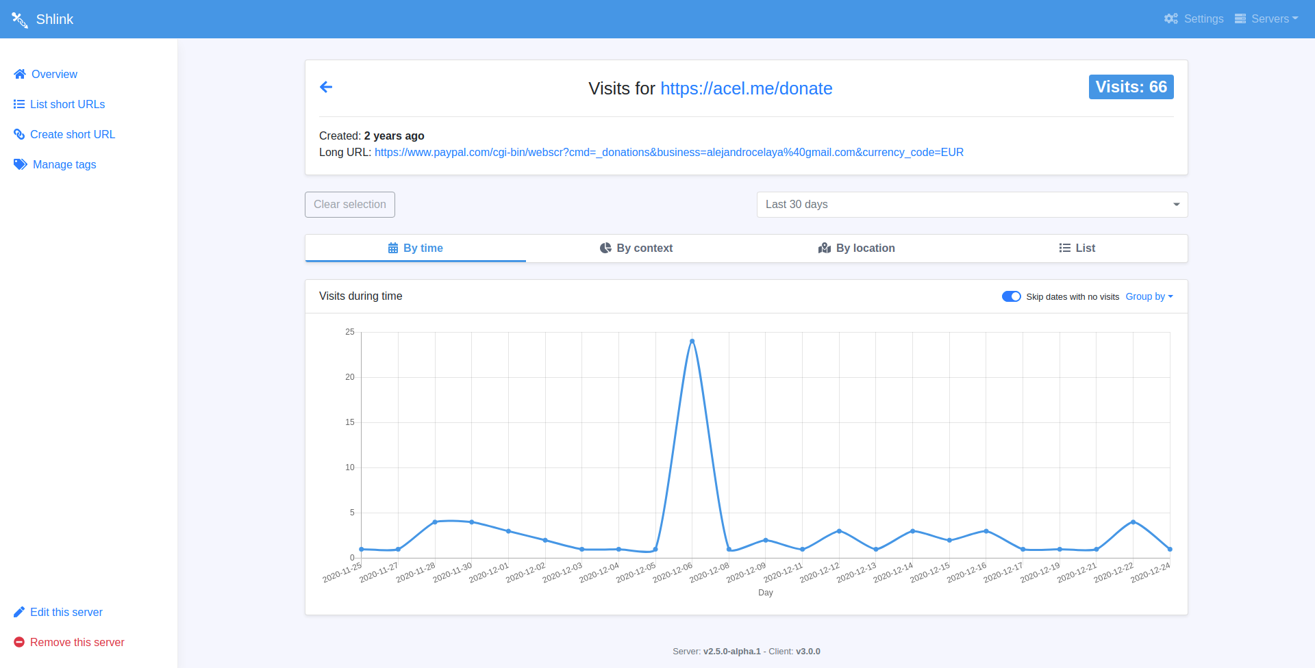
After
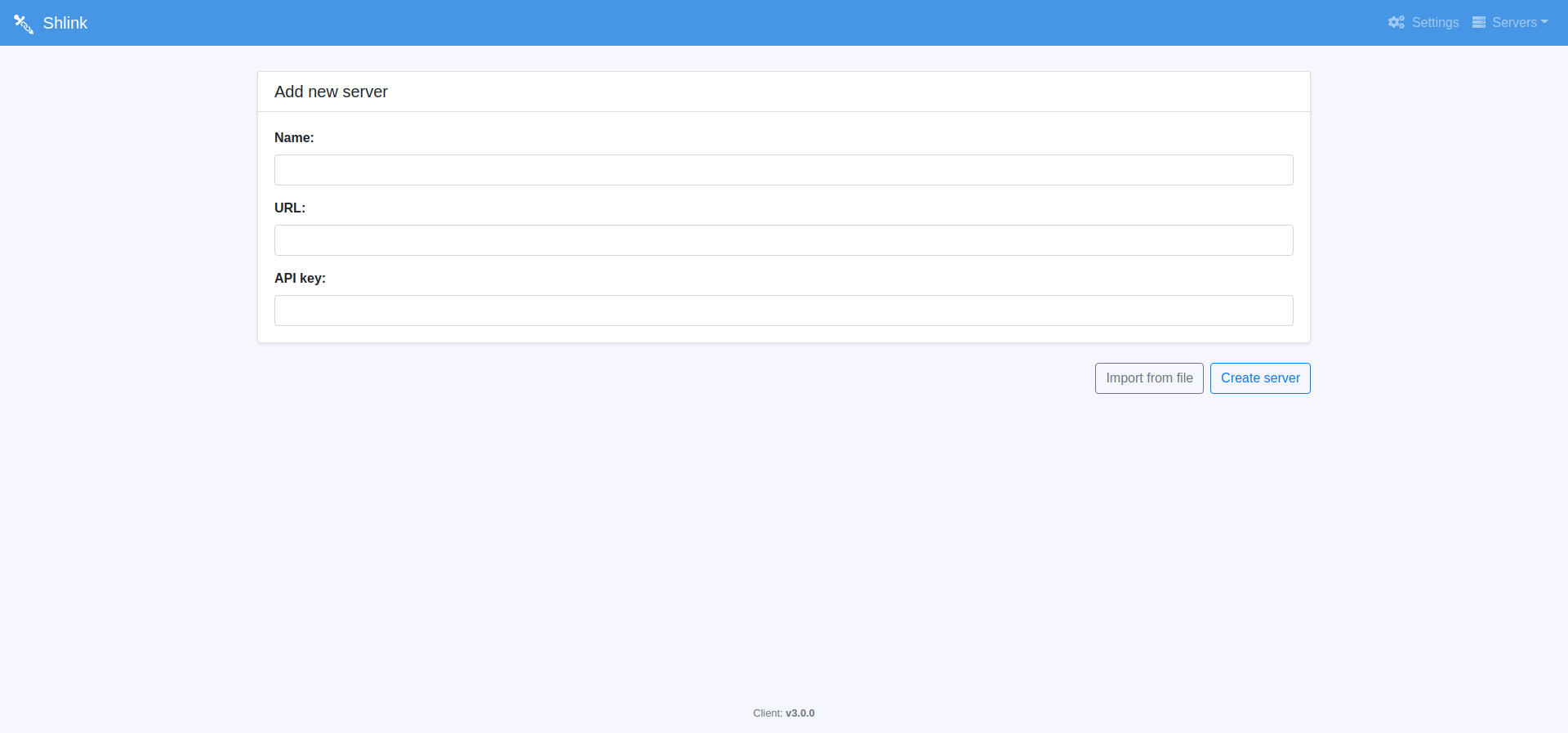
Outer sections
The app has some sections which are not related to a specific server, like creating/editing servers, or the settings page.
These sections have also been adapted to the new style, and they also have a max-width for wide screens.
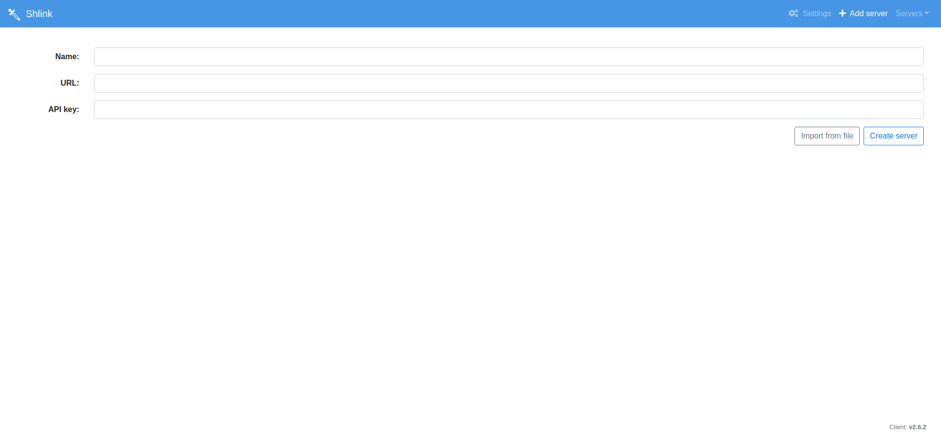
Before
After
Date range selector
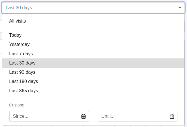
A new component allows selecting date ranges either by relative time ranges (last 30 days, last 90 days…) or by selecting absolute start and end dates.
This component is used to filter both short URL lists and visits lists.
Date range selector
Domain selector
Shlink has had multi-domain support for some versions, but changing the domain from the web client required to set the value manually, which is a bit error-prone.
This version introduces a new component which allows selecting from domains already used in the past (which is what you will want in most of the cases), preventing accidental typos.
It also allows setting new values in case you want to use a new domain that you never used before. This domain will then appear in the list the next time.

Existing domains

New domain
Other improvements
The changes described so far were the major ones. However, v3.0.0 includes a few other minor improvements.
- Result and loading messages have been standardized: They are now more consistent and use the same set of components, which also ensures consistency in the future.
- Error messages are now more descriptive: Instead of showing generic error messages when API calls fail, the actual error message is now always displayed, so that it’s easier to know what failed.
- Dropped support for Shlink v1: All major versions come with some breaking changes that improve code maintainability. This one drops Shlink v1 support, which allows removing some conditional paths here and there.
Other than the last point, Shlink v3.0.0 is mostly backwards compatible, so it’s safe to upgrade if you are already using Shlink v2.x
Next steps
Of course this doesn’t end here, and I have a lot of ideas to improve it even further.
- Dark theme: It’s what the cool kids do these days, and I have already done some experiments around it.
- Shlink dashboard: Next gen web app for Shlink. You can read the whole reasoning in this issue.
- Filtering in lists added to URL: Many sections allow filtering lists, but the state is saved in memory, which means it gets lost if the page is refreshed, and it cannot be bookmarked. The intention is to make all filtering params to become part of the URL.
- Exporting visits in CSV: It’s cool to see charts full of info, but sometimes admins need to feed other services with the data, and consuming the original API is not always an option. Exporting visits to a CSV file will be supported soon by shlink-web-client.